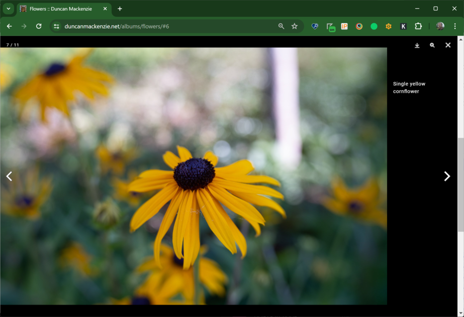
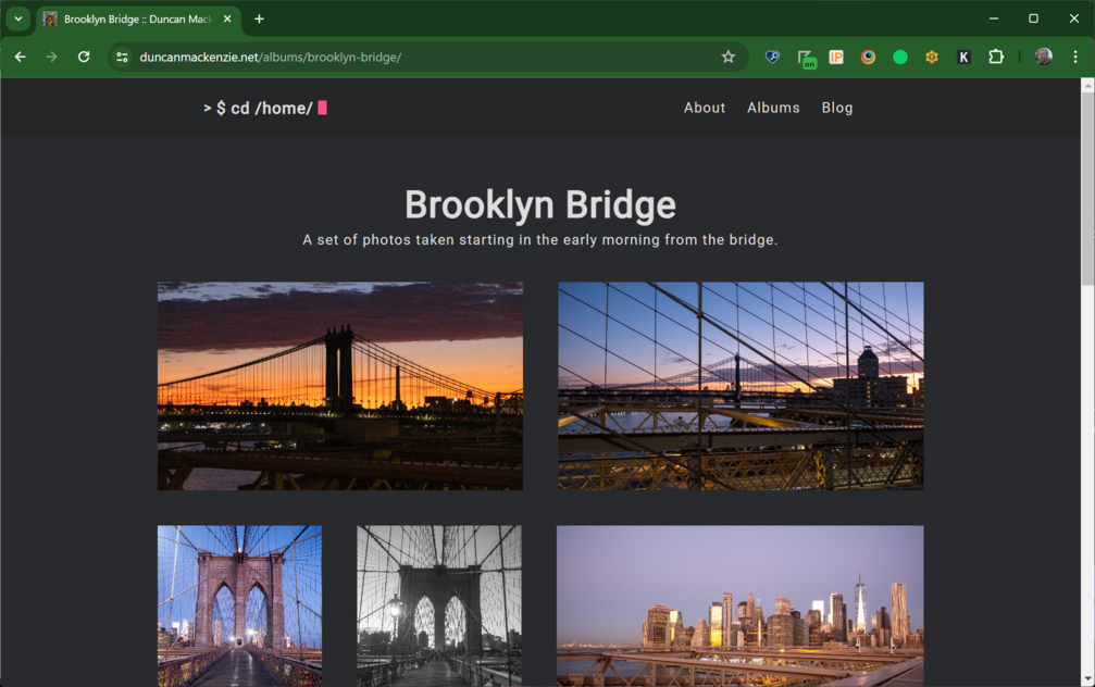
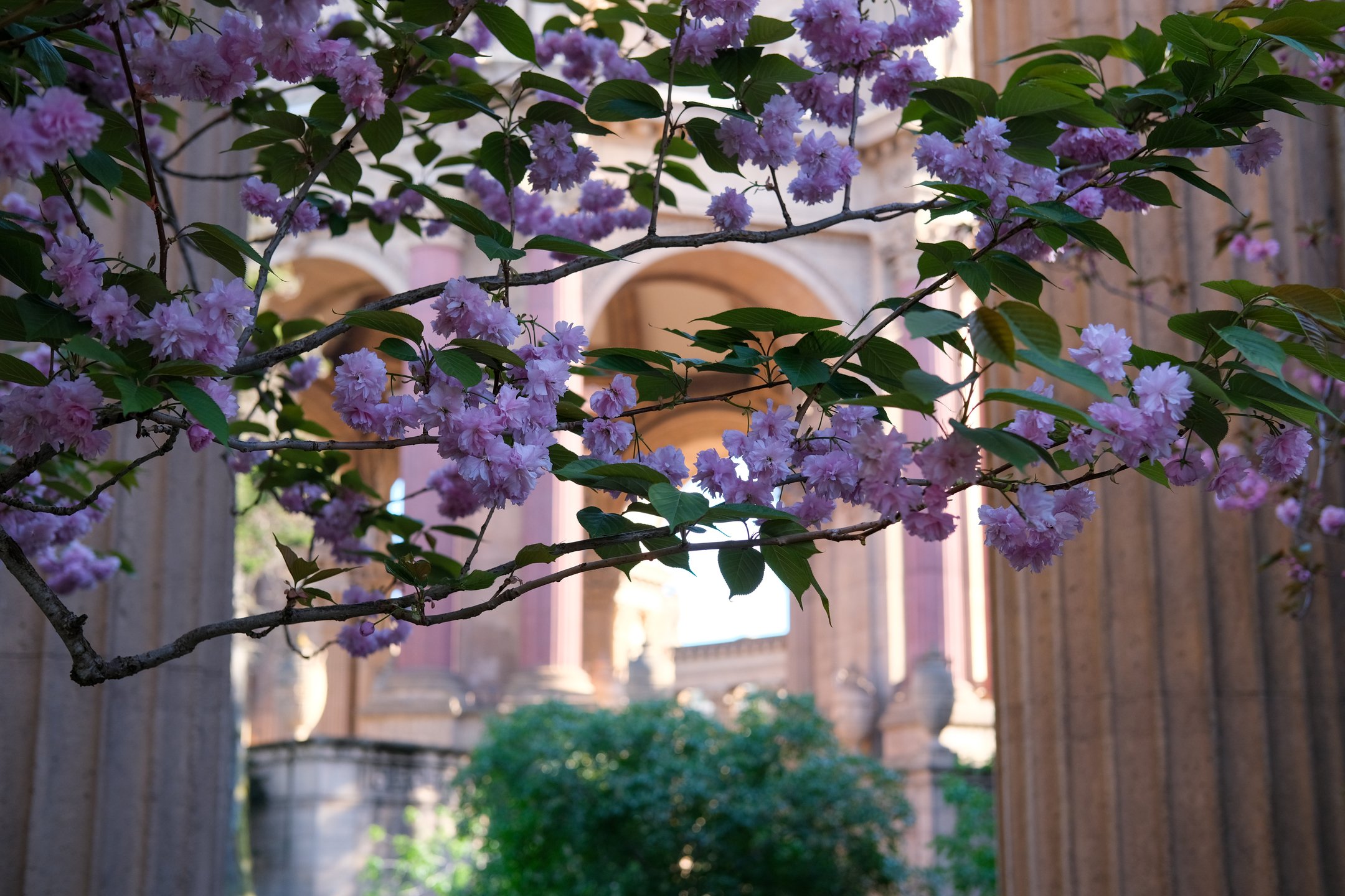
I mostly talk about work on this site, but I do have other interests! While I do a few different things, I have one main hobby, and that’s photography. I take courses in it, I spend too much money on it, I travel places with photos in mind, and I’ve ended up with 100s of photos that I really like. So, for years I’ve wanted to post these pictures online (beyond just Instagram) but creating an online photo gallery that I’d be happy with is a bit of work.
The gold standard for personal online photo galleries is Paul Stamatiou’s huge collection, a beautifully curated web experience that is both aesthetically and technically impressive. I’m not trying to emulate that experience, in fact I never even looked at the source of those pages, but it was certainly an inspiration.
A couple of weeks ago, I took a Saturday afternoon (in between dog walks and doing laundry) and started digging into this project, starting with writing up my list of requirements:
- Part of my existing site (Hugo, static web site, hosted on Azure).
- Image sets (multiple resolutions).
- Image data pulled from EXIF (Title == Caption, Caption == ALT Text).
- Images uploaded to blob storage, accessed through a CDN.
- Images not stored in GitHub … thumbnails though maybe?
- Lightbox/zoom.
- Built off of my Lightroom (Adobe image editing and organization app) albums.
Why not images in GitHub? It will work to do this, and for a small repo like mine it would be fine, but Git is not great at handling binaries. It bloats the repo, and since my source of truth is elsewhere (Lightroom/Adobe in my case) I don’t gain any value in storing them there. When I worked on Microsoft Docs, we checked images for all the documentation into Git, and it wasn’t long before the GitHub engineers were emailing us asking us to please stop. 7 GB repositories are a pain for their infrastructure.
Phase 2 (I originally thought I’d get to this later, but I’ve done it already. More on that below)
- Create a feature to embed a nice album link into other pages.
- Create a feature to embed an image from an album into other pages (with all the same functionality).
On top of all of that, I have certain opinions about the web, which added some other requirements:
- JavaScript should be kept to a minimum, ideally not required at all.
- The pages should be fast, with no visual jank (layout shift).
- Everything should be accessible.
- If a new domain is required, it should be using my own primary one.
With all that in mind, I started researching (also known as much Googling). First, I was curious if I could use an API to, at build time, pull photos and information from my Adobe Lightroom albums. I’m already using Lightroom and the organizational grouping matches what I wanted to do on my own site, so it seemed like a good option. Unfortunately, I couldn’t figure this out at all. APIs exist, but it wasn’t just a matter of authenticating with my Adobe account, the Lightroom APIs said “Adobe review required” … and so I dropped this path and decided to work with folders of files on my local machine. This had the side benefit of removing a dependency on a 3rd party, so I could manage my photos in some other system in the future without impacting this process.
Creating my album data #
I originally thought a good path forward would be to use the Data file feature of Hugo, creating a JSON file with all my album data and then using that information to generate pages at build time. That’s not where I ended up, but regardless I jumped into Visual Studio and created a console app to take a folder full of files and create the data structures I wanted. This console app takes a directory path, pointing to images exported at full quality out of Lightroom, and using Magick.NET (a .NET wrapper library around ImageMagick), generate 4 sizes of each image (220, 540, 1080, and 2160 pixels wide), pull out the EXIF and other metadata, and produce a JSON file with all that information. Next I upload those images to my Azure blob storage container, which I do manually at the moment, but I could automate it in the future.
The app, which could be replicated in bash, node, or whatever you like to work with (since ImageMagick has a CLI it would be easy to automate with nearly anything), is available in GitHub if you are interested. The output file, with some empty fields that I haven’t decided to use yet, looks like this:
{
  "Title": "pets",
  "Description": "",
  "BaseURL": "https://photos.duncanmackenzie.net/images/pets",
  "Featured": 0,
  "Pictures": [
    {
      "Title": "Loki bursting through snow",
      "Caption": "Yellow lab running through snow that is up to his body",
      "Latitude": "",
      "Longitude": "",
      "Camera": "Canon EOS REBEL T3",
      "Lens": "EF-S18-55mm f/3.5-5.6 IS II",
      "FocalLength": "47",
      "fStop": "11",
      "DateTimeOriginal": "2016-12-30T10:46:24-08:00",
      "Links": [
        {
          "Url": "https://photos.duncanmackenzie.net/images/pets/pets-01-2160.jpg",
          "Width": 2160,
          "Height": 1440
        },
        {
          "Url": "https://photos.duncanmackenzie.net/images/pets/pets-01-1080.jpg",
          "Width": 1080,
          "Height": 720
        },
        {
          "Url": "https://photos.duncanmackenzie.net/images/pets/pets-01-540.jpg",
          "Width": 540,
          "Height": 360
        },
        {
          "Url": "https://photos.duncanmackenzie.net/images/pets/pets-01-220.jpg",
          "Width": 220,
          "Height": 147
        }
      ]
    }
  ]
}
Building the albums list and single pages #
With the available data figured out, I moved onto the HTML side of things. When working with Hugo, I usually build out a partial or a template in pure HTML, with hardcoded data, so that I can get it looking just the way I want. Having all this image data, enabled me to build this HTML with real photos and metadata, instead of using https://placehold.co/ or placekitten.com (now gone?). I started out thinking I would use an existing Hugo template, so I found this one by Nico Kaiser – Hugo Theme Gallery. As I worked through my plan, first thinking I was going to use data files, and then eventually moving my json data into the frontmatter of individual markdown files (which looks really odd in the source, but works just like having YAML there), I stole Nico’s CSS and the rough shape of his HTML, but not much of his actual Hugo implementation (there are some bits in there for sure). Nothing wrong with that code, but it is based around resources (a Hugo concept of assets attached to your content, but depends on them being stored with your markdown) and does a bunch of work with EXIF that I had decided to do in my .NET generation app.
I also ended up using the same lightbox implementation as Nico, PhotoSwipe, because I liked the look and functionality of it. Turns out Paul’s site uses it too, so that’s two recommendations, if you are considering using it. This is the only JavaScript piece to all of this, but it’s not required, clicking an image without JS will fall back to linking to the full-size file.
The Hugo theme was using a cool image layout library, but it was based around absolute positioning and I thought I could get a pretty good layout just using CSS. A bit of searching later, I found yet another bit of code I could stealleverage, “Adaptive Photo Layout with Flexbox” by Tim Van Damme. Super easy to implement, copying the CSS as-is to start, then messing with it over time, it produced a nice responsive layout that handles different aspect ratio images. I take too many landscape orientated photos, but I’m trying to mix it up, so I want a variety of photos to look great together.
All of this, done first in HTML, then in Hugo, turns into two ‘layouts’ in my theme. A List template, which is used when showing the homepage for my albums, and then a Single template that handles an individual album. I built these first without any partials, but when I was building a later feature, I ended up moving the album card out of the list view into its own file and then doing the same with the individual image code. All of the templates, partials, css, etc. are included in my blog repository.
Supporting multiple image resolutions #
The original resolution of one of my photos is over 7,000 pixels wide and could be 15+ megabytes in size, neither of which is that useful on the web. My .NET app generates various sizes and compresses the photos a bit, so it is a huge improvement, but I need to setup the html so that visitors get the right image for the width they are viewing. I knew that was possible using the <picture> element, but after yet another bit of research, I settled on another approach, the srcset attribute on <img>. The short explanation is that, while both will work, <picture> is better suited for when you have multiple image formats (like jpg and webp) or mixed aspect ratios of the same photo. srcset is specifically for providing multiple sizes of the same image in the same format, which is exactly what I’m doing. Each image, based on the URLs available in my json data, ends up with HTML like this (I removed the domain and path on the images to simplify the HTML code):
<img
  loading="lazy" width="2160" height="1440"
  src="flowers-03-2160.jpg"
  alt="yellow cornflowers in focus
  with grass in the background"
  srcset="flowers-03-2160.jpg 2160w,
    flowers-03-1080.jpg 1080w,
    flowers-03-540.jpg 540w,
    flowers-03-220.jpg 220w"
>
I’ll run through each part of that tag to explain what it does and why it is important.
- The
loading=”lazy”, which tells the browser it can defer loading this image until it is in view (within the viewport as the user scrolls, or right from the start for the first few), which defers that bandwidth use and request hit if the user doesn’t need the image yet. - The dimensions (width and height), which gives the browser enough information to leave the right space on the page before the image is loaded, which prevents jank or layout shifts as images are retrieved.
- The standard
srcattribute, which will act as the fallback for any browser that doesn’t support thesrcsetattribute (which would be surprising, but possible). There’s an argument that I should provide a smaller image here, if someone is on IE11 are they also likely on a slower internet connection? - ALT text for screenreaders, in this case pulled from the EXIF data on the photo.
- Next is the exciting bit,
srcsetwith a list of image paths and widths (2160w, 1080w and so on). This tells the browser the width of each available image, and then we let it determine what should be shown to the user. The srcset feature is a bit more complex, we could provide hints and guidance, but with this usage of it, we are saying to Chrome or another browser “I have these 4 images, with widths of 2160px through 220px, please use them as you see fit”. A user could be viewing my site and a variety of widths, but also at different pixel densities (retina screens or other kinds of high-DPI monitors are a thing), and I don’t have to worry about it at all.
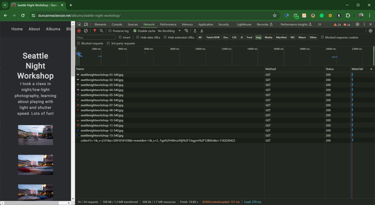
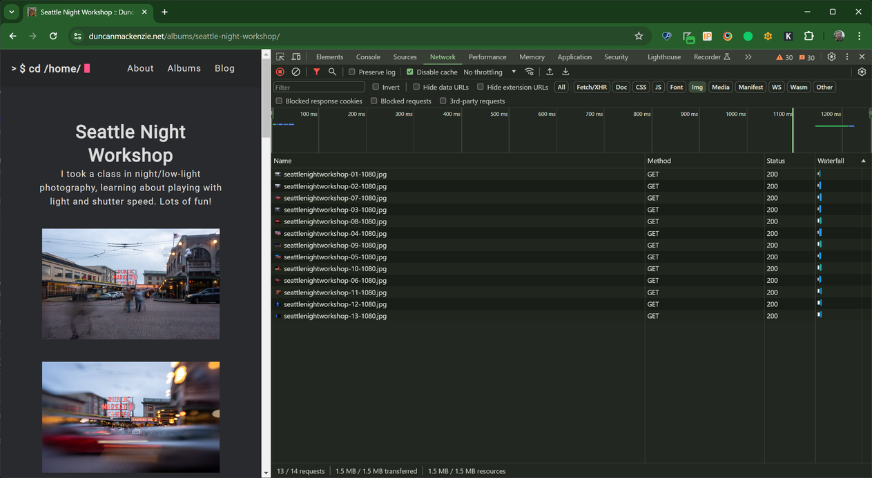
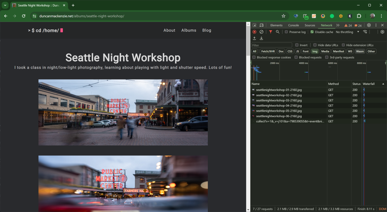
It’s a fun exercise to test out these responsive images (ok, fun for some of us), by firing up your browser’s devtools, starting out with a narrow window and watching the network panel as you stretch it out wider and wider. Make sure you have ‘disable cache’ selected and do a full reload.
At the narrow width, the browser decides on the 540px images.
Stretching the browser wider, we see the browser switch to the 1080px wide images.
Going out even wider, the 2160px images are loaded, but we also see the impact of lazy loading, as only the first few images are loaded (the rest load in as I scroll down).
You should try it, it’s fun! Also, you may see different behavior, based on your display settings, or if you happen to be using IE11, you’ll see just the 2160px images being loaded (as that’s the fallback, and IE11 doesn’t support srcset).
Creating shortcodes #
I’d like to write about my photos, and the trips they were taken on, here on this blog and if I do that, I’ll want to include links to the album and individual images in my post. To make that easier, I created two shortcodes, one to include an album:
{{% album flowers %}}
Which produces this result:
And I created another one to display a single image:
{{% albumImage flowers 1 %}}
Which produces this result
Having these available, instead of just using the regular markdown image syntax means I benefit from all the nice multi-resolution code as well as the existing ALT text and caption.
What’s left to do? #
There’s always more I could do, but for the moment the main task is to create more of these album pages, which involves curating photos and writing alt text. Beyond that, I am thinking of:
- how I could use tagging and grouping to associate albums together,
- associating blog posts with albums,
- bringing in GPS data where I have it, and
- trying to make my camera/lens info look more appealing!
